Tuesday, June 4, 2013

Final Project - Car Trip

Project from Hell.

My God, was this project a pain in the ass! It took forever just to get the frame movements to look somewhat plausible, which was made even harder by the constant crashing of Photoshop. I had to keep going back in whenever it crashed just to redo all of the work I put in, only to have it crash all over again. So annoying!

Overall, though, I thought that this project was pretty fun. The frame animation, though a bit tedious, was mindless fun, as were the many layer masks involved. It was something I was easily able to do when I needed to take my mind off of things, which made the constant crashing a bit more bearable. Coming up with the idea for the project was a process in itself, too. I went through a variety of ideas (a deer carjacking a couple driving down the road, a car running over animals on the road on their way to the zoo, etc.*) before eventually developing this piece of art. The result is something that is fun and silly, and fun to watch in itself.

Though this project certainly tested my patience, I found it quite worthwhile to do. It makes me proud to know that I made something that required so much dedication, and to see how those hours payed off in the end is really satisfying. Now that I know how to make something so interesting and cool, I would definitely do this again. It's a fun project despite the frustrations, and something that anyone can enjoy watching.

*I can't even tell you why I had such morbid ideas, but whatever.

ALL THE FEELS.

IT'S SO CUTE.

This project was admittedly quite easy, but help me develop some fundamentals in the world of animation. It was a bit of a challenge at times to put the frames in the right order, as well as  mimicking the force that gravity has over a round object as it bounces. Still, I found this project to be more of a break than a challenge, and quite adorable to watch.

This project involved frame animation and gradient for the background. That's it. Though this project could have been a bit tougher (I'll leave that for my final), I still found this project to be incredibly beneficial. I know that if I continue using Photoshop for frame animation (which is plausible, though Photoshop can be quite a pain when it comes to animating), the lessons learned from this project will be incredibly important.

Happy Snail

ALL THE FEELS. RIGHT HERE.

When I was in 5th grade, I didn't have a life. Rather than going outside and hanging out with friends all the time, I wanted to be inside playing with Word Presentation. No, not to make kickass presentations and beautiful charts (though trust me, I'm really skilled when it comes to the art of presentations). What I wanted to do was make animations, frame by frame, simply for my own entertainment. So when I was told that we were going to start an animation unit, I was obviously pumped. I loved making little skits, silly stories, and turning them into crazy animations. I was a bit rusty, admittedly, but was ready to jump right back into the world of animation with the help of much more advanced tools and developed skills.

This project was not much of a challenge, but certainly fun to do. I really enjoyed 
making my beautiful little snail friend with the use of simple animation, as well as enjoying my final product over and over and over again (seriously I've watched it way too many times). So yeah, I think that this project was worth the time it took, and with my past love for animation, would definitely do it again.

This project is adorable. Just look at it. I love it :3

Impossible Buildings (Inspired by the Works of Jim Kazanjian)

Inspired by the work of Jim Kazanjian This project was definitely a bit challenging for me, but also a lot of fun. I really enjoyed just trying to figure out what pieces of buildings would fit together, as well as how to fit each piece around each other (somewhat) cohesively. This project involved a lot of layering, layer masks, and lighting effects achieved through gradient and even more layering. This project was certainly a stretch for me creatively and tested my use of such a small base space, but I think it came out fairly well (especially when looking at the project from a distance) and would definitely be open to trying something like this again.

Monday, May 6, 2013

Perspective Part 2: The Dopest Fortress


To do this project, I started with the basic perspective layout. As said in the first part of this project, this is an crucial step, as it puts everything in perspective (ha) and allows for a cleaner product.

The next step was to actually create the building. To do this, I found a stone texture online and started distorting it to fit the lines I made. This part was slightly frustrating, as it took a few tries to get the stone texture on there correctly without completely blurring and ruining the detail of the texture.
Next, I added in a fortess door and some lighting effects to create some shadows and highlights. 

dat sunset

Then came the background. I started out with this really awesome picture of a sunset and laid the edge of the sun right on the horizon line. Next, I placed some grass into the picture and shaped it to fit well along the horizon line as well. 


After getting the background all set, it was time to combine the two pieces. I also added in a few filters here and there to help make the two pieces seem a bit more cohesive in lighting and color.
grasses and such

Although my fortress/castle was coming along pretty well, it still looked a bit out of place. To better blend the fortress into the grass, I made a quick layer mask and used a grassy paintbrush along the bottom edges of the structure. I also added in a simple pathway at this point.

finished product

And with a bit of darker edging, I was all finished. This project and I butted heads a few times, especially in the "building" process of the structure, but overall it wasn't all too bad. I'm pretty happy with the final product and enjoyed using lighting effects, layer masks, dodge and burn, and a whole lot of distortion to create my fortress. I definitely made this project a whole lot harder for myself than I could have, but I still enjoyed it and thought I learned plenty from the process.

Thursday, May 2, 2013

Perspective Part 1: Grandma's House

lines, lines, lines

 To do this project, I first started with the general layout of my one-perspective room. This was an incredibly important step, as it allowed me to easily create correctly proportioned objects and promoted further realism. 

Oh, memories!

With the framework all finished, it was time to actually fill the room with objects. Unfortunately, I don't have a high-res picture of the room on its own, but it can easily be explained as your quirky grandmother's outdated living room, complete with bright orange shag carpeting, purple paisley walls, and retro furniture. I think it came out pretty well, and had fun furnishing my little virtual room.


Now came the interesting part: finding an interesting backdrop to put my fantastically grandma-esque room in. I fooled around with all different backgrounds, including snow globes, fish tanks, and even the moon. But this picture especially spoke to me, since it's possibly the least likely place to find a building: 12,000 feet above the ground. 


To add a bit to the skydiving element, I also placed a parachute above my perspective room and added in some lines to represent cord attached to the room.

look at it goooo :-)

Finally, I decided to add some falling furniture to the picture to make things a bit more interesting. I achieved this falling effect with two separate applications of motion blur at 8-16 pixels and varying angles, all under a duplicate of the original object.


perfection!

And that was it! This certainly wasn't the most challenging project, but it was certainly fun to work with all different techniques, including a lot of distortion and 3D elements. Though I'm not sure if I'd love doing this type of project all the time, it was a great skill to be exposed to and something I enjoyed doing.


Friday, April 12, 2013

Surreal Free Choice

Be it through books full of weird facts, abstract art, or even television shows like My Strange Addiction, I've always been attracted to the strange and surreal. I just love the disconnectedness, the oddity, the fact that the surreal so often entirely differs from my comparatively dull life. It's something to experience and explore, and rarely makes sense, which is what makes it so awesome. Another fascination I've seemed to have since I was a kid is learning about astronomy. I was definitely one of those geeky kids, who watched programs on space exploration and distant worlds to satisfy my curiosity. These two passions are why for my free choice project, I decided to go in a different direction than past projects and create somewhat of a surreal scene. 

To achieve this look, a lot of shadow and lighting effects had to be used. For this reason, I relied heavily on layer masks, using the gradient tool to form a very hazy, soft spotlight on the tree and surrounding area. I also wanted the planet to be almost glowing, yet somehow distant and cold, so I used outer glow around the planet and a cool-toned filter to contrast the somewhat warmer foreground. Other touches included darkening the tree, creating a shadow though distortion and perspective, working with the coloring of the foreground, and adding in some fading stars. I wouldn't say that this project was incredibly difficult, but it definitely challenged my skills with lighting and creating a certain aura within the scene. I'm pretty happy with the outcome, and really enjoyed creating such a surreal, distant scene. I think my 8-year-old self would be proud.

Thursday, March 21, 2013

Culture Jamming


The first time I ever saw Dolce & Gabbana's Winter 2007 ad campaign, I was shocked. The image, a man holding a woman to the ground by her wrists as a group of men look on, absolutely disgusted me, not only its overt sexuality but for its blatantly violent nature as well. I hated the idea of some little girl looking at this photo and finding it to be acceptable, even appealing, so I decided that this would be a great candidate for a culture jam.


While looking around online for some inspiration, I stumbled across the painting "Tarquinius and Lucretia", painted by Hans von Aachen. The painting depicts this story:

"Tarquinius was besieging Ardea, a city of the Rutulians. The place could not be taken by force, and the Roman army lay encamped beneath the walls. Here as the king's sons, and their cousin, Tarquinius Collatinus, the son of Egerius, were feasting together, a dispute arose about the virtue of their wives. As nothing was happening in the field, they mounted their horses to visit their homes by surprise. They first went to Rome, where they sur­prised the king's daughters at a splendid banquet. They then hastened to Collatia, and there, though it was late in the night, they found Lucretia, the wife of Collatinus, spinning amid her handmaids. The beauty and virtue of Lucretia had fired the evil passions of Sextus. A few days later he returned to Collatia, where he was hospitably received by Lucretia as her husband's kinsman. In the dead of night he entered the chamber with a drawn sword ; by threatening to lay a slave with his throat cut beside her, whom he would pretend to have killed in order to avenge her husband's honour, he forced her to yield to his wishes.  
"[After the ordeal], she killed herself." -Wikipedia
It disgusted me how similar these two pictures were, especially with such a tragic story inspiring the painting. With this, I had already set my heart on creating a comparison between the two to send the message that it's unacceptable in this day and age for advertisers to convey such a sexual and violent message. Violence against women is something that should never be tolerated, and hopefully a culture jam such as the one I made can make the point that such obvious oppression is incredibly backwards.


For the culture jam itself, I first decided that it would be interesting to take the general design of the 2007 ad and transfer it over to the painting. It certainly looked cool, but it wasn't enough to actually show the similarities between the two images. I fooled around with layering them, placing them next to each other, among other things, but finally decided on creating a .gif that switched between the two pictures fairly quickly. This made the similarities somewhat obvious and was much more eye-catching than before.


Finally, I decided to turn the .gif into a billboard in New York City, to make it look a bit more realistic and interesting to the eye. I think it came out pretty well, and I enjoyed fooling around with video timeline on CS6. This was definitely an awesome project for the fact that it made you think about all of the advertisements we experience each day and how damaging they can be. I really enjoyed this project, and will definitely use quite a few of the techniques I learned in doing it (especially .gifs) in the future.


Thursday, March 14, 2013

Elephas Insecta Odobenus

Let me just say that this project was pretty awesome. It was a ton of fun fooling around on Photoshop, meshing different types of animals together, as well as playing with different picture angles and coloring. It's such a cool concept, playing God in the creation of crazy animal morphs, all while attempting to make them look somewhat plausible in an interesting environment.

I opted for the butterfly ears on a whim, since the wing shape was somewhat similar to that of an elephant's ear. I thought it looked pretty cool as it was, but wanted to make something a bit more interesting, so I decided to change up the body. For the body, I wanted to pick an animal with a somewhat similar skin texture to the elephant, but with a completely different shape to it. With this, I settled on the walrus, who I have always felt very fondly towards with its adorable whiskers and stunningly shapeless form. The entire project involved a lot of layer masks to morph together each animal part, as well as distortion, stamping, and hue changes to best create a realistic morph. 
And that's how I formulated this gem of a creature.

It did take quite a while though, to find morphs that actually worked together, and with animals I actually liked. In fact, the majority of this project was just picking which animals and pictures to morph together. I tried guinea pigs, horses, owls, sloths (my favorite), cats, and even ladybugs before finally settling on my final morph. Though, I must say that my sloth/owl combination was pretty fantastic:

angel sloth<3

I think that my morph came out pretty well. Of course, there's little things that I wish looked a bit better despite my attempts to fix them in Photoshop, but I still like what I made quite a bit. Awesome project overall, would definitely do it again.

Thursday, March 7, 2013

Graffiti Time!

This project was pretty involved, so I'll talk about each of the steps it took to reach the final look (not for any reason, I just feel like it):

Using a Bamboo tablet in Illustrator, I started playing around with different custom brushes that would achieve a graffiti-like effect. I finally settled on a more simple, rounded brush, and began to sketch out my tag.

I decided on the name "Alpha" because of an inside joke I have with my twin. I was the first twin born, hence "Alpha", and she was the second, which led to her the nickname, "Baby-B". You need street names in a place as rough and tumble as Dorset, after all.

The tag needed some more depth and interest to it, so I picked out a slightly thicker brush and went in underneath the letters to create a shadow. I also thickened the outer lines a bit to make a some contrast between the inner and outer lines of the letters.

Next, it was time to add some color to both the space within the letters and surrounding the word itself to make the tag a bit more interesting.

The tag was still pretty bland, so I went in with a thin white brush and began to highlight certain parts of the letters. This creates more of a 3D effect, as if the letters are actually raised off of the page. I also added a translucent white line directly underneath the highlight, which took a bit of the harshness away and added some realism to it, along with a shadow directly underneath the letters in a slightly darker orange for extra depth (thank you, Mr. Molinelli). Finally, I added yet another surrounding color to the entire tag in my favorite color.


Now for the hard part. Somehow, I had to take the tag I made in Illustrator and put it on an actual wall, so that it would appear as if I had actually graffitied it. This took a lot of toying around with the opacity and perspective, which I used distort and skew to achieve. I also went in with a textured eraser at 50-60% opacity and strategically removed color from certain parts of the tag. And that's it!

This project was a lot of fun and, to be honest, quite challenging. I had a pretty rough time trying to place the tag onto the wall without completely disfiguring it in the process, but it was fun trying to figure it out all the while. I also really enjoyed going back to my roots with Illustrator, as well as working with highlight and shadow to achieve a more interesting look. I've never done anything like this before, but I'd love to do it again (legally, of course).

Friday, March 1, 2013

Photomontage Fit for a Queen


I don't think I'll ever be completely happy with a project like this, but I think it looks okay. Kind of blurry in places from transforming, but it may just be my eyes as well. It was a lot of fun, though, as I was able to take random things that amuse me and turn it into something representative of my personality. I think it does me justice : )

Wednesday, February 13, 2013

The Bride of Eramore

This project started off a bit rocky, but I think it came out pretty well. I really liked the fact that the project encouraged me to learn many new techniques, including how to make fake snow, refining the edge of a mask, and text effects. I also liked that I was able to do something fairly creative, albeit a bit out of my comfort zone. Of course, the perfectionist in me found the placement of both the girl and text to be incredibly frustrating, but overall I think that the poster looks pretty great and I had a lot of fun.

Monday, February 4, 2013

The Elements of Art


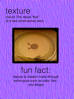
I think I did a decent job on this project. Certainly not amazing by any means, but I enjoyed it. It was fun working with all different aspects of graphic design and interesting to try new things out on Photoshop. It was also interesting to actually learn the technical definition of these terms. Overall, I found this to be an informative project, and worth the time it took.